Lean UX Design: Fail Fast, Win Big, Stay Agile
There are days when I wake up in the morning and marvel at the way things are, the way technological advancement and ingenuity has improved my life and work. Marveling at the way we access and share information or create and innovate is fitting for any day of the week. In every field there are touchpoints when something shifts, where something elevates. For UX design, this was the 2013 book Lean UX: Designing Great Products with Agile Teams by Jeff Gothelf. Gothelf’s idea revolutionized the design world by introducing a new way of understanding UX design and changed how we navigate the digital product design process.
In the near decade since, Gothelf’s Lean UX Design methodology has evolved and grown in popularity. We are some of his biggest fans, professionals who have tried this way of working and love it, and in that spirit, we offer this guide to apply Lean methodologies to your digital product design and development to create great user experiences in the most efficient way.
If you’re new to this, the first thing you need to know is that Lean UX is a system that is entirely focused on the users and requires fast and constant iteration to achieve best results. The main purpose behind switching to this dynamic is to maximize your efforts and efficiency, spending your time and money on things that truly add value. By doing this via smaller steps you can validate each time, you improve efficiency and results.
How you ask?
Well first, let’s look at an overview of the Lean UX methodology’s key characteristics:
- Small and interdisciplinary teams: one person from each area to include valuable insights and still be agile.
- Result centered: focus on the testing results instead of making iterations.
- Eliminate waste: optimize your effort and stop spending time on tasks that aren’t essential.
- Small deliveries to validate each step: start with the essential and only add things that you conclude are necessary.
- Constant learning about users: user testing and feedback is the nexus, the single most important, fastest and most effective way to build the best digital products.
- Making instead of over-thinking: Too much time analyzing, and you will miss out on the richest part of the process; testing what you have and improving it.
- Understanding the problem early: make sure you have a complete grasp of the problem you’re going to solve before the design phase.
- Mistakes: yes! You’re allowed and even encouraged to make mistakes in the initial steps, this is where you’ll learn the most. What you learn will help you achieve a polished digital product by the time you launch.
- Listening to your team: forget about stars and gurus, nobody will know your digital product as well as your team, so focus your attention on their advice and ideas.
Now that you understand key aspects of the methodology, lets delve deeper by breaking this up into sections by different days of the week. If every day has a different characteristic and discovery, so too does each of the seven phases here:
Monday: Learning
Tuesday: Reaching conclusions
Wednesday: Crafting your MVP
Thursday: Building your essentials
Friday: Lean information architecture
Saturday: Put your design to test!
Sunday: Ending and beginning
Monday: learning
Start the week off right. If you want to start on the right foot, it’s essential to have a good product strategy. When you build a digital product there are three fundamental areas: UX design, development and business. You need input and participation from all to create the best possible digital product. That’s why we bring everyone on board from the very beginning.
Forget about creating a lot of design options from which to choose or a whole proposal only to change it post feedback. Having reps from different areas alleviates these extra steps, reduces your effort and ensures that you’re focused on the right tasks. Things will move smoothly and better overall as a result.
On the other side there’s the users. The fundamental first step when starting a new digital product is getting to know the people who are going to use it. After you meet with your new client about the idea, and before creating anything, look for information about the potential users, the product’s possible competition and the company you’re working with.
The data that you collect in product strategy is not only important but can also be surprising. Even if you think you’ve learned everything about your users from your client, it’s possible that you will discover new insights that change your perspective. If so, share these with your client. They will appreciate receiving that knowledge early in the process, instead of investing time and money building the initial idea and creating a digital product that ends up not meeting users’ needs.
The key to Lean UX is failing fast to learn more. If you thought something would work and realize it doesn’t, don’t be frustrated. Take this as an opportunity to evolve your initial idea into something better. If you realize you’ve made a wrong assumption about your users, now is the time to fix that and adjust your digital product idea so it will appeal to them.
Some recommendations to get information about your users:
Secondary research: there’s plenty of studies available online, and this consists of going through what other people have found out about what you’re interested in. It’s much less expensive than conducting your own studies, and even though it doesn’t replace them, it can still provide a lot of useful information.
Surveys and interviews: both are great ways to gather data about your potential users. If you’re looking for quantitative answers to specific questions, a survey could be the right fit. On the other hand, if you have a bit more time and you’re interested in obtaining deeper responses you may lean towards a series of interviews.
Inspiration: look at other sites, analyze how they are solving problems. It will provide ideas to build your own solutions.
Contextual observation: observing the user in their natural context will give you a great idea of what they truly need and how they will interact with your digital product. If you’re going to do this, make sure you choose the right people to observe and be ready to take lots of notes, you will need them later to identify patterns.
Tuesday: reaching conclusions
I know what you’re thinking, conclusions by Tuesday? Just hear me out. Research has two phases: you consider all possible ideas and scenarios, and you take everything you’ve learned and discard ideas that weren’t successful. Here are some techniques from the Lean methodology that could help you organize all this information (it’s a lot) and make the most of it, before you dive into the initial design.
Create a proto persona: build a typical user. For this, think about an individual, with a name and specific characteristics. The goal is to give this individual a context, demographics, as well as behavior, goals and needs that represent actual users. Having a user in mind while building your digital product makes everything easier.
Build an empathy map: process the information gathered to create a better idea of your user’s needs, expectations and emotions. We recommended making a board where you can differentiate your user’s inner thoughts and outside environment. On the board write what this person does, things they hear or say, and then their challenges and the gains they would get from your solution.
Of course, everything must be related to your digital product. For example, if you’re building a product focused on fitness, you might write that this person says they would like to exercise more but doesn’t have the time, or that they’ve heard that exercising will help them focus and sleep better. From this board, you’ll find the pains and gains.
After identifying those, look for ways to maximize the gains and erase the pains; the parts of your solution that wouldn’t add to your user’s experience. Here it’s important to pay attention to the balance between gains and sacrifice: what your users will get from your product has to outweigh the sacrifice they will have to make to get it. Your product should be relevant, different, and trustworthy, that’s how you move a step closer to success.
Wednesday: crafting your MVP
“Designing without researching first is like getting in a cab and just saying ’drive!’.” (Facebook team quote)
It’s the middle of the work week and almost halfway through this Lean UX methodology. At this point, you’ve completed the first research phase and you have enough information to start your product design. Here are some concepts and exercises from the Lean methodology that will be useful when creating an MVP.
Moscow method: your first version of the digital product should be composed of only the essential parts. To organize the functionalities, put them into different categories based on all the things you have learned thus far about the users.
The “must have” is what you’ll use to create the MVP and it’s the core functionalities of your solution.
The “should have” is when you group the functionalities that are important to achieve success but won’t be part of the MVP. They are the first things you will add after testing the first part.
The “cool to have” are things that would improve the UX and add gains. These things aren’t too expensive, so it’s good to keep them in the backlog, but they are not essential.
Lastly the “won’t have” list. Some of your initial ideas just won’t work, and the smartest thing to do is discard them early. Don’t get attached to your first idea, it should evolve!
Something to keep in mind when defining what your MVP will look like is that it should have the essential amount of all the things that compose it. Many people think that an MVP is complete with only functionalities, and we think that’s a mistake. If you want an MVP that you can test properly, add elements that are important, and contemplate reliability, usability, and design.
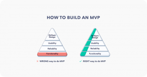
Always remember the basics of Lean UX design:
- Clear words: short and simple phrases are the way to go.
- Purpose: every visual element must be useful and necessary.
- Appropriate device: think of what your users will use.
- Time: interactions must be fast and optimal.
- Behavior: keep in mind the reactions and emotions your digital product will evoke.
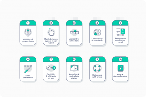
The usability principles by Jakob Nielsen come to mind, a good set of rules that fit well with the Lean methodology and have proven effective.
Thursday: building your essentials.
It’s almost the weekend and you’re all set to start creating your MVP now! Here are some Lean UX tips to keep in mind during this phase when you start to move closer to your product development.
Sitemaps: these hierarchical maps show all the app’s sites and are useful to define the navigation, calculate the size of the content and provide a more accurate estimation of our future work. We recommend building one using tools for people with no design background; that will make it easier to present to stakeholders.
User flow: there are many questions that you can ask when creating the user flow. How do our users reach the conversion site? How many steps in the buying process? What’s the goal of each page? What functionalities will our users want to find? Each site should have a clear purpose. Remember, if it’s not essential, move it to the next phase.
Crazy 8s: if you’re blocked during this phase or want to try something different, this is a great exercise. It’s about designing 8 different ideas for a page in 5 minutes. It sounds crazy, but focus on the core of each idea and forget about the details that you can polish later. The goal is to move past the first thing you create, which is usually the less innovative.
Sketching: draw your first ideas, this makes them accessible to everyone on the team and it’s a fast and easy way to catch design mistakes and focus on improvement.
Wireframes and prototypes: when following the Lean UX methodologies, we first draw an idea using no computer, then transform into a low fidelity WF, then a high fidelity WF, and finally a mockup that includes every element from colors to chosen letter fonts. If we’re working for a mobile solution, it’s common to just create a high fidelity WF from the beginning. To avoid creating a mockup and having too many things to change, validate each idea. This will help things move faster with stakeholders. Make sure to prepare the presentation thoughtfully. Remember that everyone must be able to understand the functionalities.
Skeleton frames: thinking about this will help you visualize how the content and information will appear and reveal if the organization is successful and what changes you must make. Many apps and sites show these skeletons as the content is loading, which is a great idea because it helps users quickly understand where everything is going to be.
Design patterns: you won’t invent every part of your design. There are some solutions that are common to popular digital products, and as the Lean UX fans insist there’s no need to introduce new ways of doing those things. Your users spend a lot of time using other apps, and things will be easier for them if your design respects the patterns. Don’t make it harder for them to interact with your digital product or more labor intensive for you!
Friday: Lean information architecture.
TGIF! By now you’re very close to finishing your MVP and ready to test and iterate, as the Lean UX methodology suggests. But first let’s review some rules of information architecture that will help when the time comes to add all of the content into your solution.
Information architecture means organizing the content in a strategic way, so our users can find everything easily. Remember, we want things to be simple. To achieve that, we have to structure our design to be able to combine the best organizational methods for the information we’re going to provide.
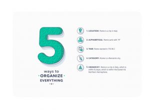
For this step, we need to consider three variables: context, content, and users. The combination creates a space from which we can design our information architecture.
Information architecture should help our users understand where they are, what they’ve found, what other things they can expect to find, and what’s around. Think about signs in an airport or at the supermarket; if they’re well designed it’s easy to find what you need without asking for help.
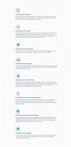
Saturday: put your design to test!
Who doesn’t want to repeat Saturday’s? And just like our favorite day of the week, you will go through this step countless times during your digital product life cycle. It’s a key part of your product growth, because this is where you test your MVP and get all the feedback you need to turn that first version into an extended one.
As we explained before, this is an essential part of the Lean UX methodology. By testing and validating frequently, you will be confident that you’re not wasting time designing and developing functionalities that aren’t necessary. You will start with an MVP and only add things that users really want.
Before you take your digital product to your users, make sure to test it yourself a couple of times to make sure everything works like it should. Once you’re ready, select the people that you’re going to observe.
The best thing is having actual users, but if funding or time don’t allow, you can ask other people, it will still be super helpful!
Make sure that you explain to your users that you’re testing the design, not them; it helps so they don’t get frustrated if they can’t complete some of the tasks. You can tell them to explain their actions out loud, so you understand why they are interacting with the digital product a certain way and what they expect to find with each step.
If the user can’t complete a task, explain that it’s not a problem and skip it. It’s better to avoid unnecessary frustration or pressure.
Once you finish this step, you should have a clear idea of what parts of the design are too complicated or frustrating for the users. With that, you will work to make them clearer and more intuitive.
Sunday: ending and beginning
Congratulations! You’ve reached the end of the week: the end of a very important phase, and also the beginning of the next one. Creating a digital product is not a straight line. We like to think about it more like a spiraling shape, where you evolve by reviewing all your past steps. Kind of like life.
During your digital product life cycle, you will create many different things, discover new functionalities, design new interactions, test countless ideas and keep the best from each cycle. You will learn, grow and improve, and so will your process and digital products.
We hope this Lean UX guide can help you along the way. If you’re seeking more help with creating disruptive and amazing digital products, please tell us about your project, we would love to join in!
