Contents
How to create the perfect SaaS landing page
SaaS is booming with innovative startups and platforms popping up every day. But with so many fish in the sea, it can be hard to stand out. Converting leads is essential in today’s busy online world but it’s easier said than done. This is where landing pages come in.
A landing page is the bread and butter of SaaS businesses. They’re specifically designed to push leads steadily toward a certain action, be that signing onto a newsletter or starting a free trial of your product. An effective landing page is instrumental in influencing your leads’ decision to transition to paying customer.
With landing pages being so important, you want to ensure your own is pulling its weight. Today we’re going to guide you through creating the perfect SaaS landing page, first by giving you a roadmap of features and then using that roadmap to analyze some of the best examples on the web today.
Let’s get started.
What is a SaaS landing page?
Software as a service is a niche industry that requires a different approach to the traditional landing page. A landing page, in this instance, is a web page that’s designed to persuade a visitor to take a specific action. The action they take will depend on what your conversion goal is for the page.
Specific landing pages might aim to:
- Add contacts to your email list
- Urge visitors to download a whitepaper or eBook
- Collect signups to a free consultation
- Drive sales of a particular SaaS product
Landing pages can be tailored to any goal. Your landing page design can facilitate creativity and innovation, but in order to ensure your page is as functional as it is beautiful, you have to know what options are available to you.
One of the best ways to learn how to build a great landing page is by researching what already works. Looking at some successful SaaS landing page examples is a great way to find your inspiration and ensure you’re on the right track when developing your own page.
Elements of a successful SaaS landing page
An effective landing page has a tried and true structure. While you can get creative with the design of your page, you have to ensure the baseline elements are all there to ensure it functions properly.
Each landing page generally has:
A hero section
The hero section of your page is the elements that are “above the fold” or visible in the viewport before people scroll. It should contain all the necessary information required to take action immediately, including an enticing headline and a compelling call to action.
The hero section is essentially a summary of the rest of your page. People should be able to tell who you are and what you offer before they begin to scroll.
Social proof
Social proof is a psychological phenomenon wherein a person will assume the actions of others as a way to reflect the right behavior for a given situation. In the world of marketing, this means demonstrating that other people have engaged positively with your brand as a means of influencing leads to convert.
Social proof on a landing page can take many forms, including:
- Testimonials
- Reviews
- Client logos
- Awards
- User statistics
- Success stories
Features and benefits
The features and benefits of your product should be well established on your landing page. You want to illustrate that you understand your audience’s pain points and that your product features are positioned specifically to address them.
Input form
This is the means by which you’ll collect information from your audience. Whether you’re harvesting emails or other data, your landing page must have a method of audience interaction. This might take the form of a contact form or an email box.
Call to action
Your call to action is the desired action you want your visitors to take. It might be signing up to your newsletter or buying your product. Whatever your call to action, you must ensure it’s clear and concise. It should appear more than once on your landing page but not so much that it feels spammy.
No distractions
Cross-linking isn’t your friend on landing pages. You want to limit your audience’s exit opportunities, encouraging them to follow your call to action and ONLY your call to action. Any other superfluous information or links should be culled.
A positive user experience
This is where your design comes in. Your page must load fast, be mobile responsive, and have a flawless layout. Your audience should be able to navigate your page quickly and easily while also engaging with the information provided.
Tracking
Every landing page needs a way for you to track your results. You might implement call tracking, Google analytics, or use a CRM to monitor how users are interacting with your page. No matter how you decide to track your results, you must be able to determine the success or failure of your venture.
Examples of SaaS landing pages that convert
Now you know what goes into a successful landing page, let’s take a look at a few examples of these elements in action. The following pages are all highly-performing and relevant examples of effective landing page design.
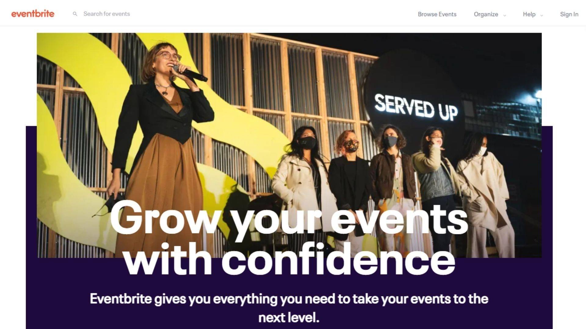
Eventbrite has an amazing example of a SaaS landing page that prioritizes branding-first design. The design they’ve chosen here perfectly illustrates who they are and what they do.
Their hero section is meticulously developed with a targeted title, subtitle, and call to action. It employs an engaging visual hero image that illustrates their market position and people-focused product while also ensuring their heading isn’t lost in the weeds.
Their page is exceptionally easy to navigate with anchor links just below the hero section outlining the benefits and features that will be outlined further down the page. This not only prepares the visitor for the content that’s to come, but it also gives them the chance to skip to the section of the page that addresses their specific pain points.
Each pain point is addressed within the page’s features and benefits sections. Eventbrite itself has a diverse target audience so they have to ensure their landing page covers a wide array of different perspectives. By structuring their page the way they have they ensure they don’t miss targeting anyone even as people are able to drill down into their personalized requirements.
Further down the page is a simple yet effective testimonial panel. It shows a picture of the reviewer as well as their words which works to connect visitors more effectively to the message.
They do include a link out to compare their different packages, however that link is effective in context. It allows people who still aren’t convinced to do more research into their offering, effectively funneling them to a separate landing page that loops back to their initial call to action: “get started free”.
Finally, their footer section contains everything it needs for an effective landing page conclusion. It reiterates the message of the page itself with an engaging heading and subheading, followed by the oft-repeated call to action.
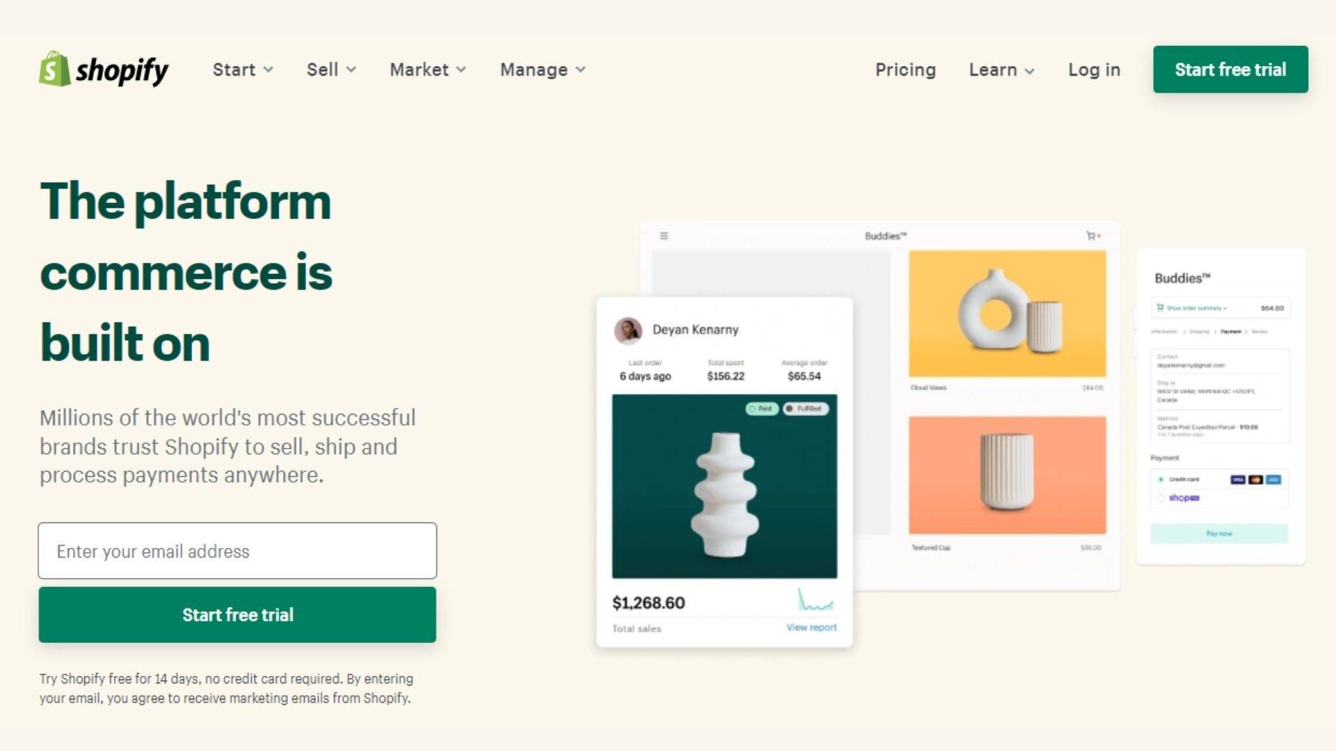
Shopify’s home page offers a great example of a SaaS landing page that gets results. It jumps right in with an eye-catching hero image combined with an engaging headline and a web form built right in above the fold. Everything a visitor needs to start using the service is right there at the head of the page.
From there they jump into their first social proof section, listing five examples of prominent websites built using their platform. Each one is an example from a different industry, ensuring the most coverage possible for their diverse target market.
Shopify understands that their target audience has a myriad of pain points. Some are starting their business from scratch while others are switching to Shopify after using a different platform. Their landing page ensures each of these demographics is taken care of, offering four different paths to approach their service.
Their features and benefits section is concise and clear, offering visitors more information on each, should they want to explore further. While this is a break from the traditional landing page practice of keeping outgoing links to a minimum, this being their homepage allows for some leeway.
One thing that Shopify does incredibly well is illustrate their social proof through repeated examples. Their homepage states:
“Over 1,700,000 businesses in 175 countries around the world have made over $200 billion USD in sales using Shopify.”
If that isn’t a powerful statement we don’t know what is.
Along with the initial five examples and a testimonial section further down the page, Shopify touches on their social proof strengths a total of three times. This might seem like overkill but with a business as diverse and massive as Shopify, they’re right to do their best to humanize themselves through customer connections.
Finally, their concluding section is straightforward and cohesive, reiterating their selling point (a free trial) and giving a clear call to action.
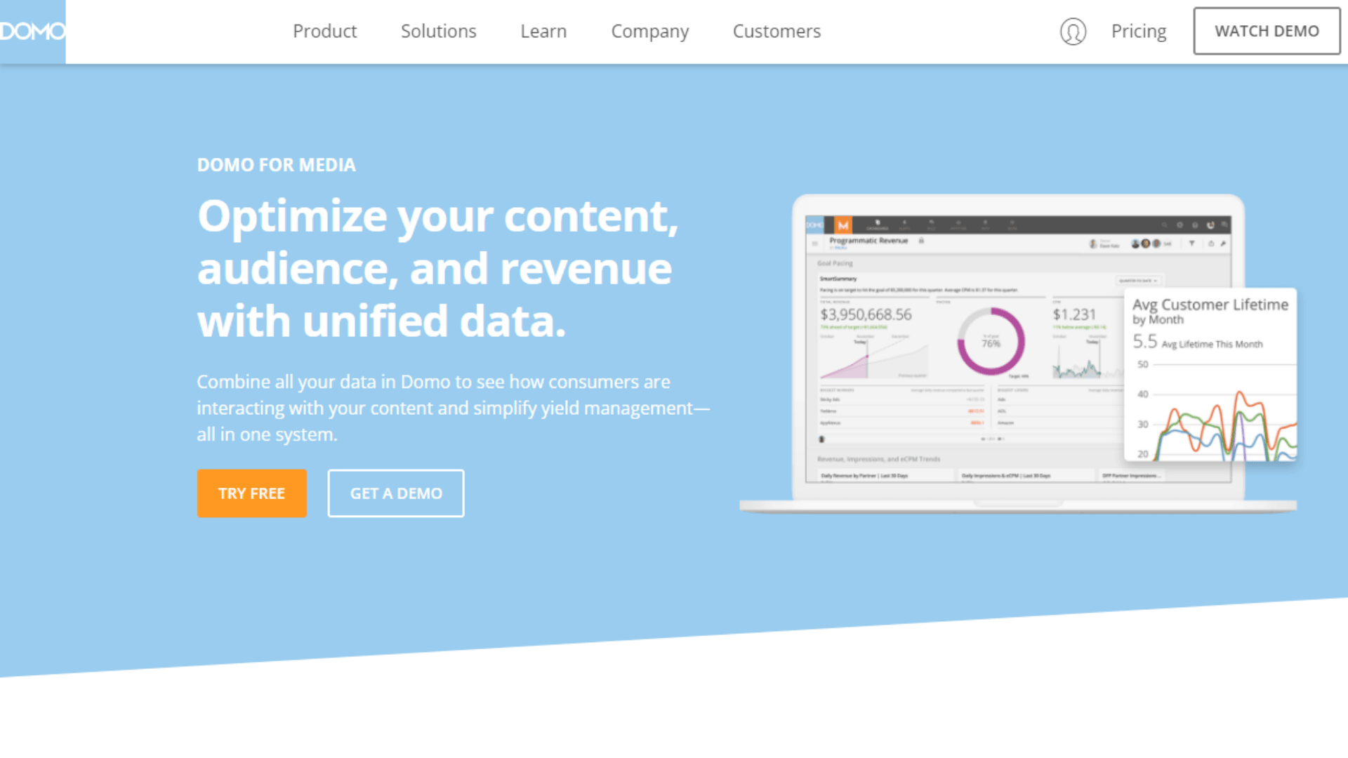
Domo’s industry landing pages are all worth a view, but their media page is a particularly good case study.
Their hero section is clear and concise, offering a visual mockup of their product along with an engaging headline. This page technically has two calls to action:
- Try free
- Get a demo
But you’ll notice both serve the same purpose: to get the user exploring their service on their own terms. By offering a demo as well as a free trial, they’re capturing leads at different points of the sales funnel, ensuring each is offered a solution to their problem.
The hero section is followed by a simple yet effective client logo list. There’s no need for Domo to beat you over the head with social proof – the names on their list of clients (including National Geographic and The Washington Post) do enough heavy lifting for them.
From there they dive into their features and benefits. Much like Eventbrite, they offer users a way to navigate these so that they can read about the benefits that apply directly to them. For a company with such a diverse target market, this is a really effective design technique.
Finally, their concluding panel is simple yet effective, offering visitors the choice of trying the service for free or getting a live demo.
Domo’s landing page here is a great example of a business stripping away any distractions to focus their efforts on what a landing page does best: convert leads.
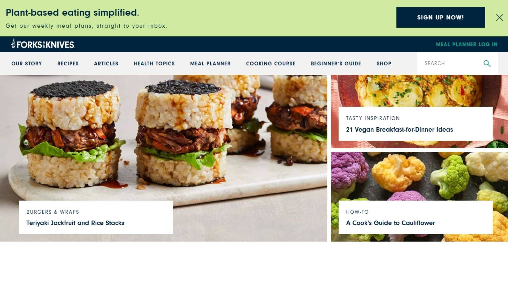
Forks Over Knives is a nutritional website that encourages people to live healthier lives by changing the way they view nutrition. Its home page is a great example of a landing page that converts.
While it’s visually busier than most on this list, it still makes sure to keep visitors focused on their call to action. Their “sign up now” button is above the fold and anchored to the head of the page, so it follows you even as you scroll through the rest of what they have to offer.
Its focus is on the site’s features and benefits, with each unique section of the homepage branching off onto different areas of the site. While comprehensive, each call to action is clear and concise, allowing different demographics to find what they need to.
Their social proof section is also well-executed. Overall, the page achieves what it sets out to do, which is to drive visitors to sign up to their site.
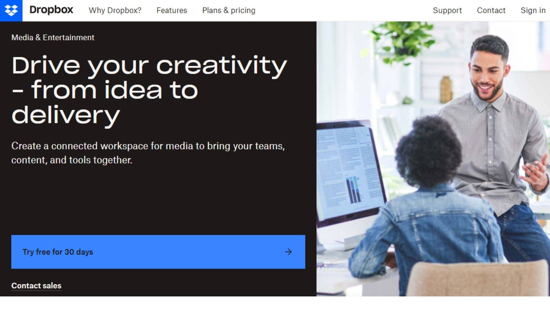
Dropbox’s industry landing pages are just as effective as Domo’s. Their media and entertainment page is a great example of a landing page pulling out all the stops.
Its hero section humanizes the company with compelling visuals and an eye-catching headline. By the time you get to the call to action you understand what the company is and what you can achieve by partnering with them.
The section below the fold starts with the features and benefits of the application, listing key answers to their target audience’s pain points. They state you can collaborate easily and efficiently from anywhere – one of the company’s greatest sales points.
Following the features is their inclusion of social proof with four testimonials from four different companies. These are set in a slider to keep the visitor from feeling overwhelmed – keeping the page free of superfluous distractions.
Dropbox’s page then dives back into their features – a theme for the design itself that speaks to the company’s dedication to providing a quality service. Their service packages are clearly and concisely outlined, giving visitors all the information they need to make an informed decision about whether or not to engage their services.
Their final panel offers two calls to action:
- Try free for 30 days
- Or purchase now
Both are offering a clear path to using Dropbox’s product making them relevant and clear even if a choice is presented to the visitor.
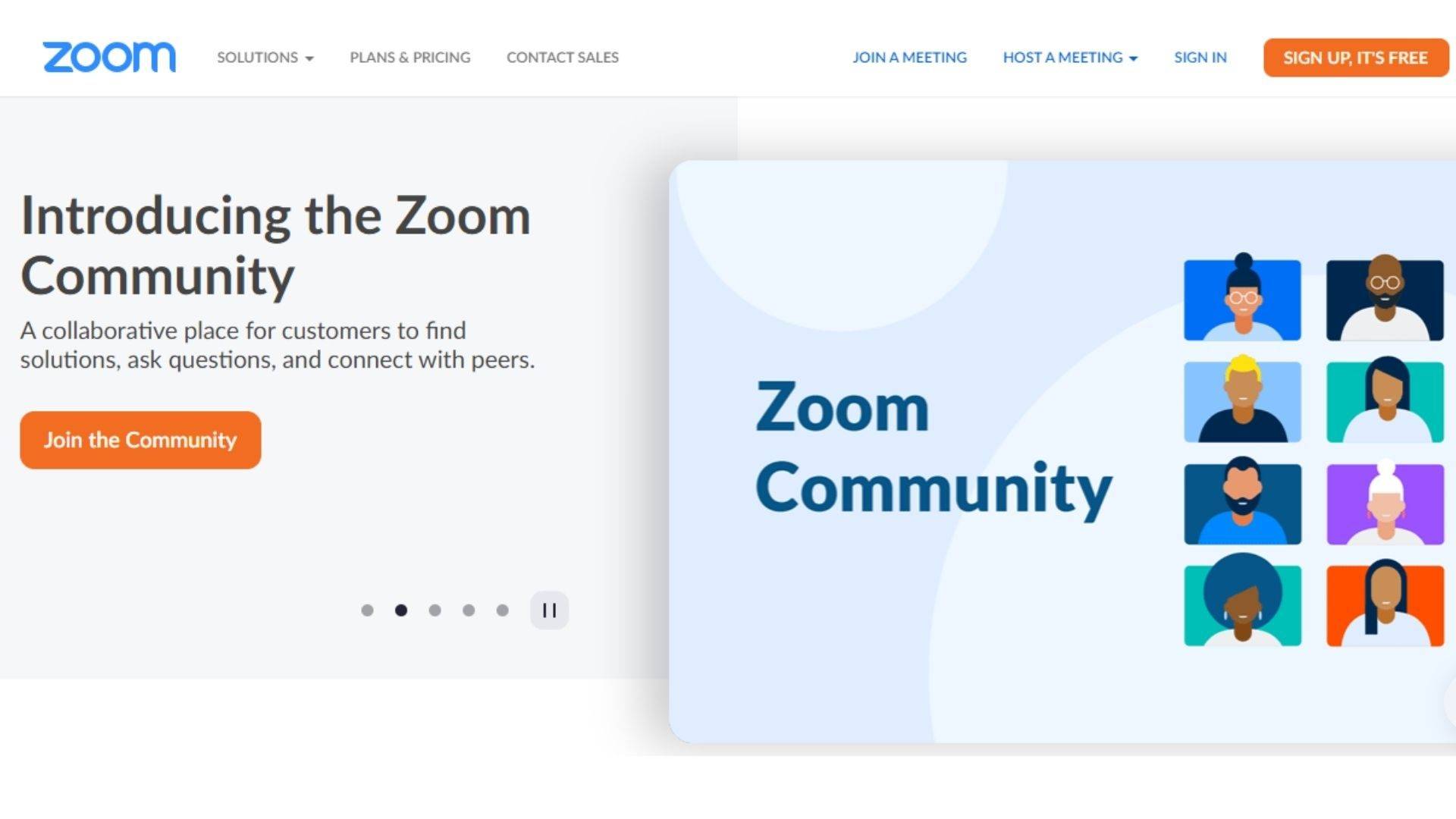
Zoom is one of the most successful SaaS companies operating in the world today. Their product is second to none, and their landing page illustrates their dedication to providing singular service incredibly well.
Their hero section offers a strong headline, brief explanation of their product, and a solid call to action. Combined with a healthy aesthetic design, it works to hook the viewer within seconds of the page loading.
Their features section is incredibly enticing, laid out almost as an infographic. This easy-to-consume format is indicative of the product’s own ease of use, fostering a sense of familiarity and trust in the page visitor.
From there, the company leans heavily into its social proof. It boasts a list of five star rankings from existing customers, followed by a slider of testimonials from some big name brands. Rounding out their social proof section is a list of recognizable client logos, offering proof that some of the biggest names in the world trust their product to help them do business.
Their call to action at the bottom of the page is concise and effective, offering visitors the choice of requesting a demo or signing up for the service immediately.
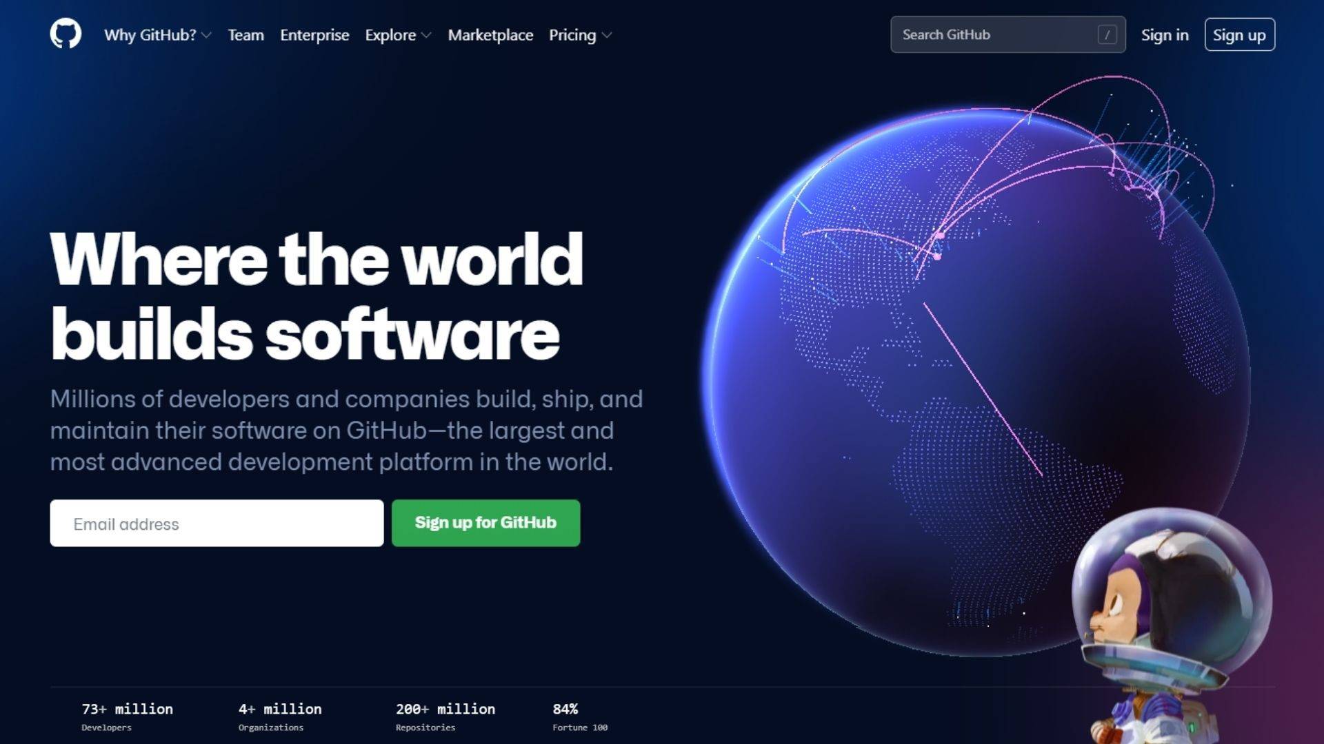
Github is a landing page built by programmers for programmers. As a result it’s one of the more robust examples on this list as far as the sheer amount of information it imparts.
It’s hero section bursts out of the gate incredibly strong. With animated visuals and a heading that packs a punch, Github promises to be the only development platform you’ll ever need. A simple email input invites visitors to sign up to Github for free – a compelling call to action unto itself. The page also packs some social proof above the fold, offering user statistics that prove to leads that they’re in good company if they sign onto the platform.
Below the fold is a comprehensive list of features and benefits. While the details might seem overkill, you have to remember who their target market is: programmers. This is a crowd that wants to see under the hood of any product they intend to use. Github knows this and successfully imparts their program’s many technical features in a clear, comprehensive way.
Github’s landing page design really can’t be faulted. Through savvy use of scrolling animations and soft loading, they ensure the visitor never feels overwhelmed by the content of the page. Instead, the experience is a smooth and clean one.
Their final call to action section sums up the page clearly and without fanfare. Users are invited to “make their contribution” and given two choices:
- Sign up for Github
- Contact sales
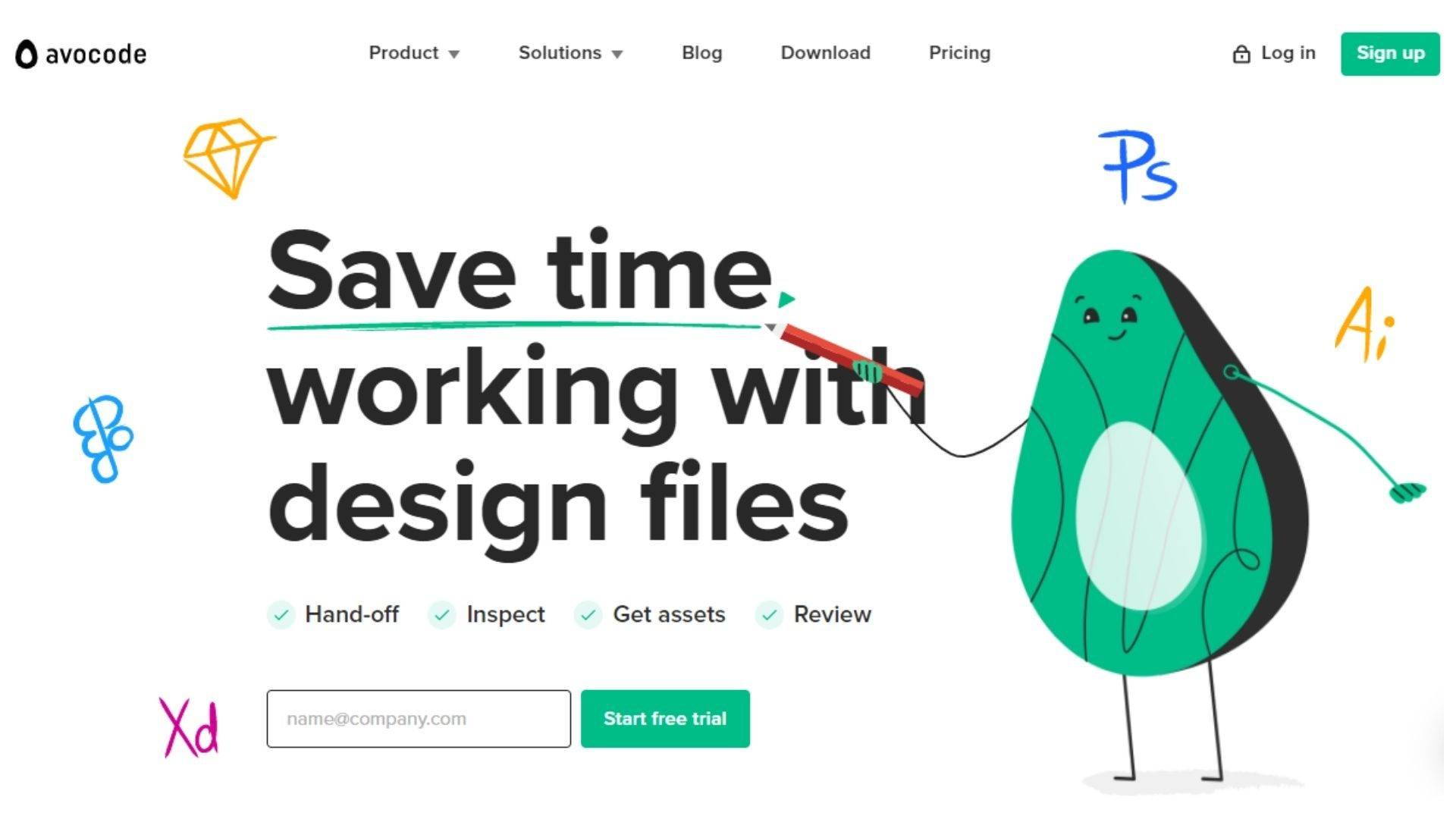
Avocode is one of the most well-designed landing page on this list and for good reason: it’s built by designers for designers. As a platform that facilitates collaboration on design files they had to bring their a-game, and they certainly did.
Their hero content is cute and effective with an eye-catching headline, clear brand summary, and strong call to action.
Below the fold is a simple client logo list, giving the company a boost of social proof by associating them with some of the biggest brands in the world including ebay and Tesla.
From there it’s a well-designed mix of features and more social proof, with each pain point addressed and then rounded out with a customer testimonial. This is a bold decision by Avocode that could have been overwhelming in less apt hands but the design of the page ensures the information is kept structured and savvy.
Leaning heavily on the social proof again is the next landing page section which highlights some customer testimonials before the page rounds out with a solid call to action section. Visitors are invited to either sign up for the web app or download the desktop app – both calls to action that invite people to start using the product immediately.
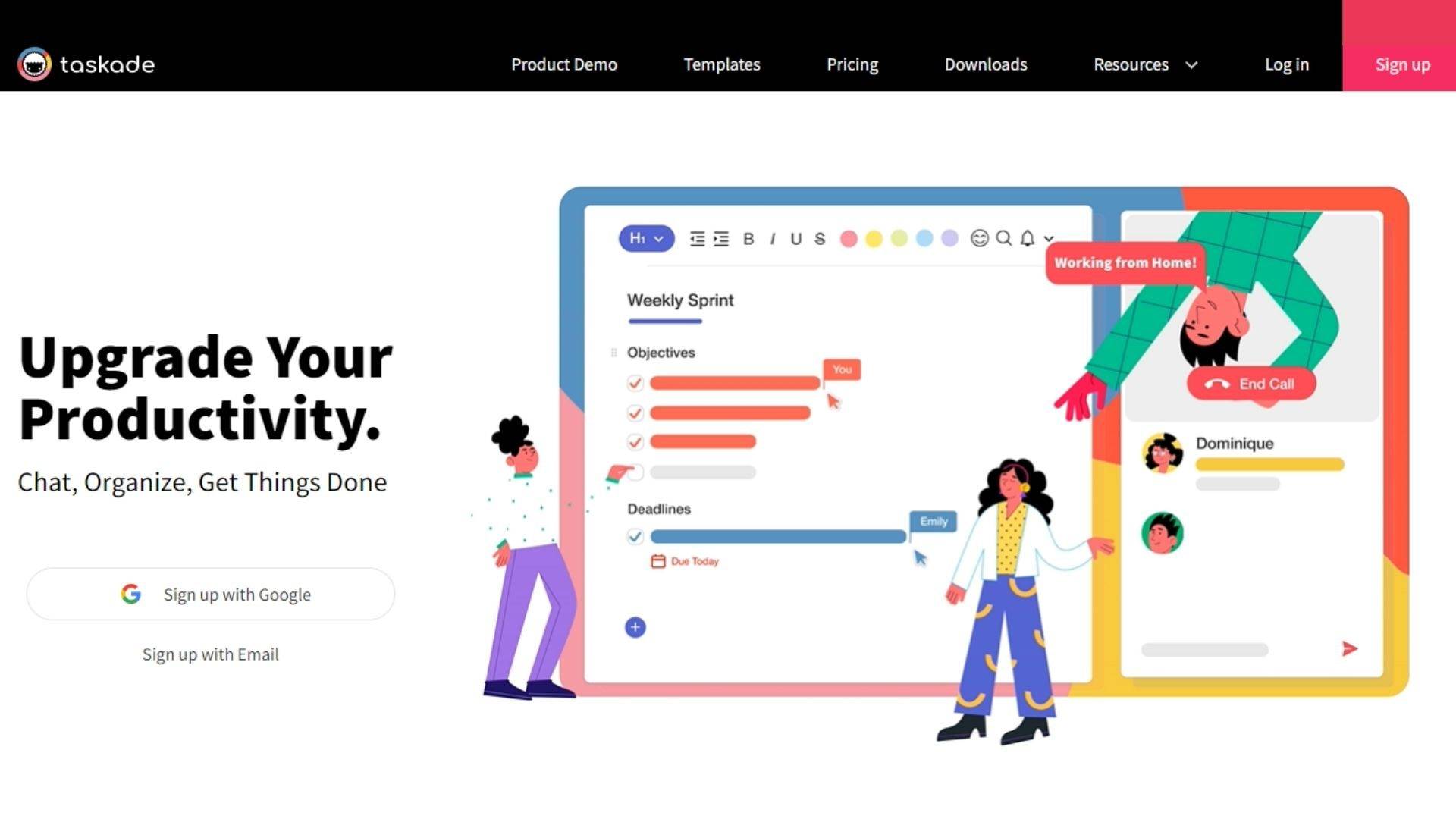
Taskade is a productivity app that helps users map out workflows and organize tasks. Their SaaS landing page is clean, concise, and effective.
Their hero section is made more dynamic through the use of animated visuals, drawing the eye and ensuring the audience is engaged. Combined with a killer heading and a clear call to action, this opener has everything a solid landing page needs.
Their features and benefits are broken down into easily digestible sub-categories with a clear navigational menu. Using screenshots of the app itself gives the visitor a clear idea of how their product works and what it can do.
Next up is a clear call to action to download their app followed by more sub sections that address the audience’s pain points. Each includes a call to action pushing the visitor to get started using the application.
Their conclusion reiterates the benefits of their product and invites the visitor to sign up to their service for free – a compelling call to action for any brand.
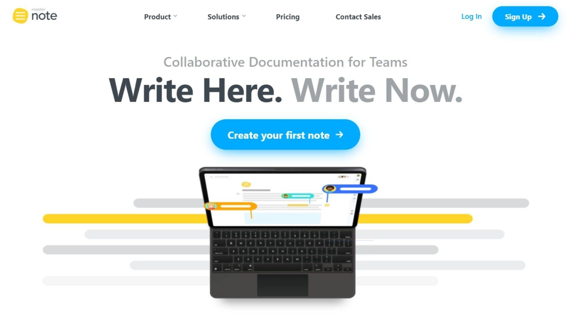
Meisternote is a collaborative documentation application that helps remote teams work together. Their landing page starts off incredibly strong with an eye-catching headline and a strong call to action: “Create your first note”.
From there, the page dives into a short list of benefits before fleshing out the product’s purpose. While this may seem superfluous, the brevity of the hero section dictates the necessity of this extra short introduction.
Meisternote’s features and benefits are then expanded upon in a clean, easy-to-navigate subsection that allows users to choose which feature they want to explore at any given time. Visitors are offered a clear understanding of how the application operates and exactly what pain points are being addressed.
This landing page is one of the more text-heavy on this list but it’s so well-structured it can get away with it. Each section is broken up with a clear call to action that encourages the visitor to start using the product immediately.
The company’s social proof is taken care of with a short note from the CEO of the company. It could probably stand to include more customer-generated content but the slant towards fleshing out the product’s benefits gives the page enough information to be getting on with.
The conclusion of the page provides a clear summary of the benefits of the application as well as a solid, familiar call to action.
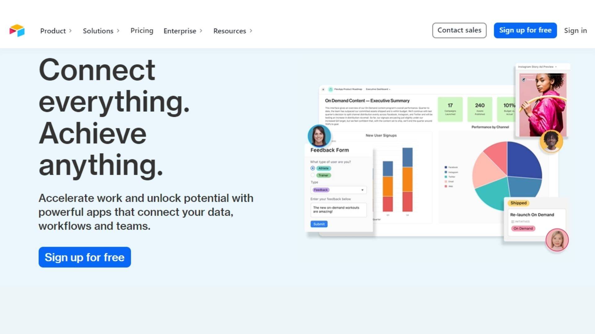
A low-code platform for developing collaborative apps, AirTable is one of the more complicated products on this list but the landing page is effective in streamlining the features and product proposition.
The hero section utilizes animated graphics to catch the eye and draw the visitor’s attention to the headline and call to action. From there it dives straight into the social proof with a simple list of client logos, including some big names like Netflix and Medium.
Each sub section that follows clearly outlines the product’s features and benefits, illustrating the points visually with animated imagery as well.
A testimonial section adds a dose of more social proof to the mix, including video content that gives visitors a hearty dose of engagement. This is quickly followed by the page’s conclusion that encourages people to sign up for free and offers this excellent social incentive:
“250,000+ innovative companies use Airtable every day. Join them.”

Create a SaaS landing page that converts
SaaS landing pages are crucial when it comes to guiding prospective customers through the sales funnel. With the right approach and a hefty bout of creativity you’ll be able to create a landing page that effectively guides leads through to a specific action.
All the landing pages on this list make for excellent examples of SaaS landing pages that convert, but understanding the makeup of an effective landing page is only step one. You also have to ensure your landing page effectively communicates your brand and your company ethos. The more authentic your design, the better your chances of hooking the trust of your audience. And a trusting audience is one more likely to convert.
Now you have a solid understanding of what goes into making a great landing page. With the right formula, an adherence to your brand, and a good helping of creativity you’ll be well on your way to designing a killer landing page for you SaaS business.